Canadian Designer Accordion Book
An accordion book inspired by Carl Dair.

Project Context
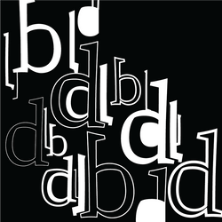
Canadian history is something you always learn in grade school, but how much do you do but the design pioneers that have helped to form this country? I didn't. Upon further research I was pleased to learn about names such as Ron McDonald, Stuart Ash, Fritz Gottschalk and Burton Kramer. These designers, along with others have created works such as the CBC logo, CN Railway Logo, identities for the no name brand. Inspired by the work I say, I created an accordion book solely using patterns inspired by typographer; Carl Dair. He is known for creating a typeface called Cartier which was commissioned and released for Canada's 1967 centenary celebrations publishing a book, Design with Type in 1952. In it he described principals of design using primarily typefaces; in particular, he outlined visual principles of harmony and contrast, while codifying seven kinds of typographic elements: size, weight, structure, form, texture, colour, and direction.
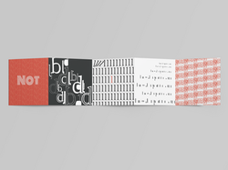
Each sleeve of the accordion book focuses on a visual principle that Dair has mentioned in Design with Type, along with his 6 pamphlets titled Typographic Quest.
Mood Board and Aesthetics
This mood board takes reference from works created by Carl Dair (Design with Type) and emphasizes his distinct and minimal colour palette comprised of red, black, gray (occasionally brown and blue), as well as use of transparency, direction, and scale. By studying these elements, I was able to incorporate them into my design and reflect Dair’s typographic style

Final Book Pages
For the final pages I limited the the colour palette was limited to red, white and black so that the typography could remain the focus.
 |  |  |
|---|---|---|
 |  |  |
 |  |
Accordion Book Mockup
 |  |
|---|